Typography at 100 Feet: Why Fonts Can Make or Break Billboards
Fonts can make or break a billboard. In outdoor advertising, the right typography ensures clarity, readability, and impact—even from 100 feet away. Learn how smart font choices can elevate your OOH ads and make your advertising billboards unforgettable.
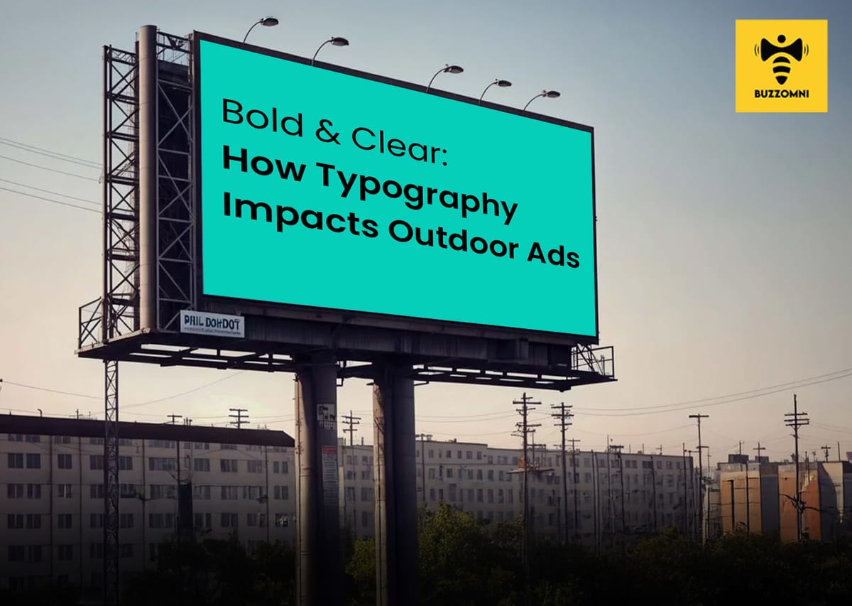
Table of Contents
- Introduction
- The Role of Typography in Outdoor Advertising
- Readability Over Style
- Less Is More
- Brand Consistency Matters
- Digital vs. Traditional Billboards
- Testing and Execution
- Conclusion
Introduction
When it comes to outdoor advertising, size matters—but so does clarity. The average driver spends only a few seconds glancing at a billboard. In that short window, every element of your advertising billboard must work in harmony to communicate the message effectively. Among these elements, typography is often the unsung hero—or villain.
The fonts you choose can make or break your OOH ads, impacting both readability and brand perception. Brands planning high-impact outdoor campaigns often turn to experts like BuzzOmni to ensure their typography and design capture attention instantly.
The Role of Typography in Outdoor Advertising
Billboards are not books or websites where people linger. They are fleeting moments in a commuter's day, part of the larger world of out of home advertising. A well-chosen font can catch the eye, guide attention, and reinforce your brand identity. Conversely, poor typography can render even the most creative advertising in billboards invisible or confusing.
Readability Over Style
At a distance of 100 feet—or more—fonts that might look elegant up close can become unreadable. Thin, intricate, or overly decorative fonts often fail in OOH advertising contexts. Outdoor billboard companies recommend bold, sans-serif fonts for maximum legibility. Letters need to breathe, spacing should be generous, and text must contrast sharply against the background to ensure drivers and pedestrians can absorb the message in a fraction of a second.
Less Is More
Billboards have a limited attention window. Experts in outdoor billboard advertising often stress the importance of minimal text. A single, clear message, rendered in a font that’s easy to read from afar, will outperform a dense block of copy in a fancy typeface. The goal is to make your outdoor ads instantly understandable.
Brand Consistency Matters
Typography does more than convey words—it conveys personality. Just as a brand’s colors, logos, and imagery communicate identity, fonts reinforce tone. A playful script might suit a children’s product in a digital or print campaign, but it can appear cluttered or illegible on a highway digital advertising billboard. Advertising billboard companies emphasize that consistency across all OOH ads builds recognition and trust.
Digital vs. Traditional Billboards
With the rise of digital advertising billboards, typography has become even more critical. Motion and light can enhance visibility, but fonts still need to be readable at a glance. While traditional outdoor billboard companies focus on static placements, digital formats allow for animations, transitions, and changing fonts—but legibility remains paramount. Poor font choices can distract or confuse viewers rather than attract them.
Testing and Execution
Successful outdoor advertising campaigns often start with mock-ups at actual scale. Outdoor billboard companies will frequently test different font sizes, spacing, and layouts to determine the optimal combination for readability. This testing ensures that the advertising billboard delivers maximum impact and avoids common pitfalls like overcrowding, illegible text, or inappropriate style choices.
Conclusion
Typography may seem like a minor detail in out of home advertising, but its impact is monumental. From roadside advertising billboards to bustling city centers filled with OOH ads, the fonts you choose determine whether your message is seen, understood, and remembered.
For brands looking to maximize the ROI of their outdoor billboard advertising, investing time in the right typography is not optional—it’s essential. After all, at 100 feet, the right font can turn a fleeting glance into lasting recognition.
Enhance your next campaign with BuzzOmni’s end-to-end outdoor and out of home advertising services